This week the designers had to create a look for going out on the town inspired by New York at night. The soggy double-decker tourbus dropped a group in the areas of Washington Square Park, Times Square, New York Public Library, and Greenwich Village. They were given an hour to photograph inspirations for their look.
Of course, Stella doesn't know how to work modern technology (very rock and roll - did you see how Ozzy can't turn on his television without Sharon's help?) and Blayne is chasing the neon dragon.
Blayne is back on my shit list. What the f&$% was up with him staring creepily bug eyed at Kenley and saying he was going to eat her? Did he think it was precious? It would've been way funnier if he threatened to tan her...
He's just a weirdo for attention's sake as far as I can see, and as a true weirdo who's in it for myself, I just can't respect a whore in a weirdo suit.
Worse than Blayne, Suede's talking about Suede appears to be escalating. It is spiraling out of control. Please somebody stop him before this epidemic spreads.
The only thing that could make Blayne worse is if he started referring to himself as Blaynelicious.
I'm pretty sure that shot of Stella in spandex prison stripe pants blinded me for at least 5 minutes. Someone needs to pass a spandex law. I think the only solution is to outlaw it altogether.
Why was Sandra Bernhardt a guest judge? Why not just use Kathy Griffin. Aren't they interchangable? I always thought she was like Diet Sandra Bernhardt or Sandra Bernhardt Zero. I know Bravo could use some more cross promotion. SB is one of those cautionary "keep the botulism outta yer face" tales.
I love Tim no matter what, but I wish he wouldn't lend encouragement to the catch phrasers. That being said, it's always great to teach the older generation slang and watch them stumble with it, it's like watching dogs get drunk or toddlers swear.
Blayne

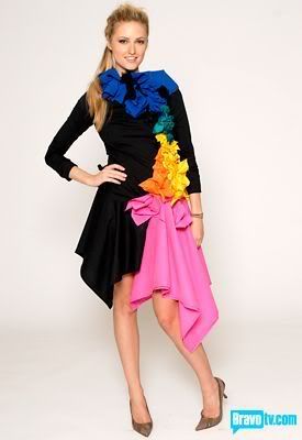
This is either a gay pride parade float or wardrobe from a Jem and the Holograms show. It's repugnant. Just as grossly annoying as Emily's but less classy and more drag queen.
Daniel

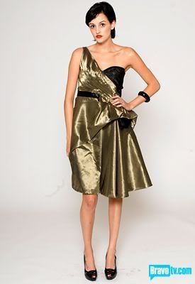
Off the rack. Not the best fabric or the best presentation. The hem looks sloppy and I'm bored.
Emily

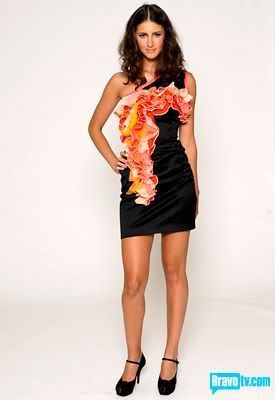
This dress was uninspired. Tim tried to steer you right, but like so many before you, his sound advice was disregarded. Your designs bear resemblance to your taste in jewelry, white trash charms all the way.
Jennifer

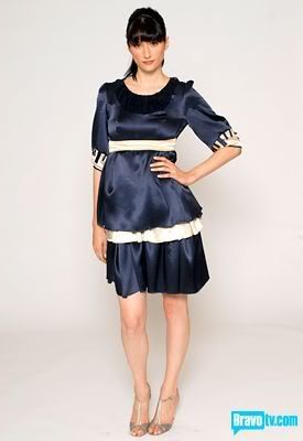
You are frumpy, your dress was frumpy. I don't know how you, being more boring than drying paint, were saved in favor of kicking Emily off, but you're lucky.
Jerell

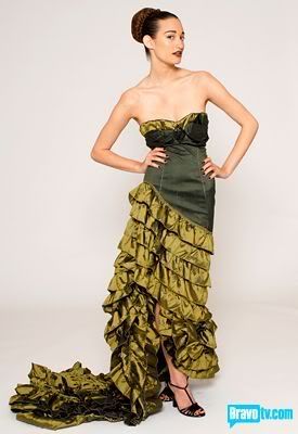
Didn't like it. I felt for a night on the town it was overwrought and resembled a salsa costume. It appeared well made, but would be more appropriate for a gala or red carpet event, and I wouldn't consider either a night out on the town.
Joe


I liked this actually. The detail shots looked better than the wide shot does. I'm not sure the fit was exactly right.
Keith

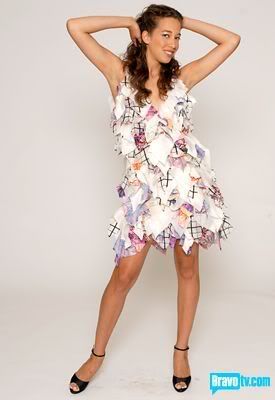
You are boring. Your newspaper inspiration was thin. Your model was not thanks to your dress made of shapeless cloth globs.
Kelli

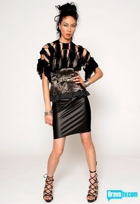
I thought it was interesting and provocative. The detail didn't show up wonderfully on the television because of all the black.
Kenley

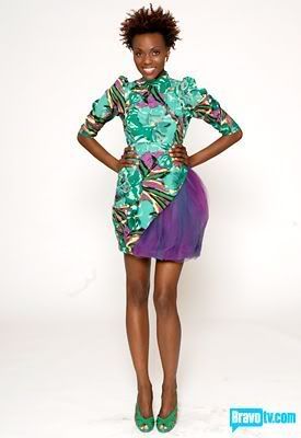
I should've liked this dress, but I didn't. It was too 80s for me and the print was too Laura Ashley. Not the least bit wearable. If they admired it as a runway piece, it was too reminiscent of Nicolas Ghesquière's Spring 08 Balenciaga designs.
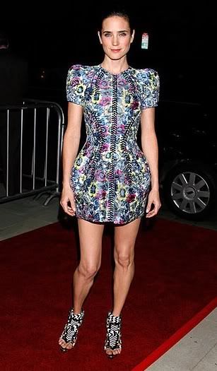
It was certainly bold, but not so fresh.
Korto

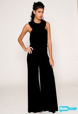
Bland. Forgettable.
Leanne

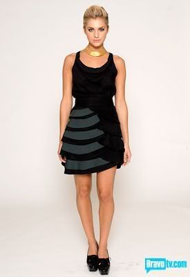
I would've picked this as the winning design. So fresh and easy and could go anywhere. I was glad to see a restrained hand from her this week.
Stella

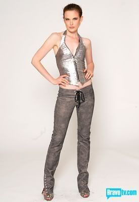
Great for a night out to the biker bar with Kat Von D. Never gonna be anything more than a tiny niche market designer with your lethas.
Suede

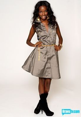
Straight up trash. The fabric is a bad color and looks cheap. The dress looks wrinkled and poorly sewn. The design is awful. Should've been in the bottom three.
Terri

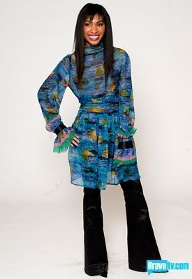
I don't understand this being in the top three. I didn't like it. It was not working at all for me. It seemed pedestrian. I just wrote "ICK!" in my notes.
In my projected top 3:
1.Kelli
2.Joe
3.Kenley
Most awful awards:
1. Suede
2. Blayne
3. Jerell

No comments:
Post a Comment